 |
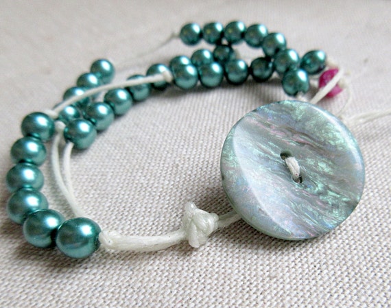
| Newtonian Constant of Gravitation Bracelet by Kokoba |
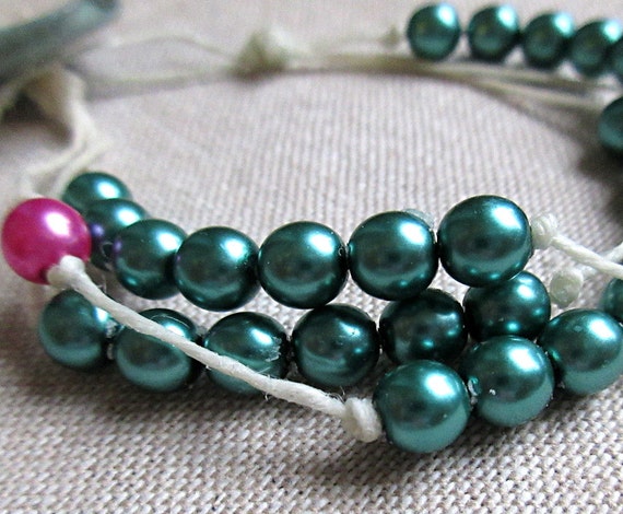
The digits of the Newtonian constant of gravitation are spelled out in the rich blue beads. I'm not sure what color to call them. They're a little more blue than I usually call turquoise, but I can't think of anything better. Indigo, maybe? Seafoam? The lone pink bead you see there is a placeholder for 0. (It makes a nice accent piece too, don't you think?)
(And speaking of physics, this physics infographic with PENGUINS!! has been my favorite #sciart offering this week. Go on, have a look!)
One of the greatest and worst things about being your own jewelry boss is that you can get carried away with color palettes that you love to death. Great because it's fun to work with colors you love! Worse because it's easy to become really repetitive, or only have things that are to your taste in your shop.
Now, I don't believe in following trends or the Pantone color of the year or what have you. I think, if you're an indie artisan, you should make things that you would actually wear (or at least not be embarrassed to wear). But I also believe that it's important to experiment with new styles and color palettes and try to reach out to the customers you have who are almost like you, but not quite.
It's been a really fun run with these colors I've been using lately—bright pink, indigo-turquoise, fire engine read—and I'm sure I'll come back to them, but my inner store critic is telling me it's time to move on. I'm not entirely sure what I to focus on next. Fiery reds, yellows, and oranges? More maille? (Yes, always more maille.) Understated neutrals? Rich jewel tones?
Tell me, what colors do you find yourself drawn to these days? Has it been consistent over time, or does it change with moods/life stages/the weather?


No comments:
Post a Comment